Hello from Boulder Colorado!
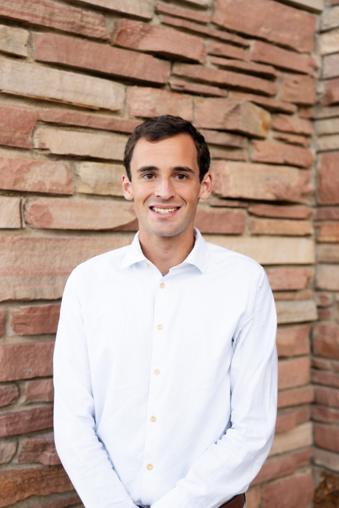
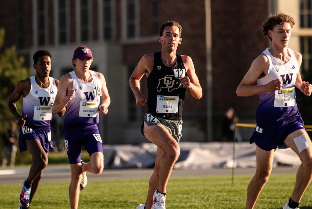
I’m Jake Derouin. I am a CU Boulder alum currently pursuing professional triathlon.
I am extremely passionate about many aspects of technology and have made numerous tech related projects on the side. Please see my projects tab to learn more.
Athletic Career
Triathlon late 2024-present
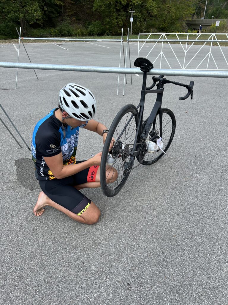
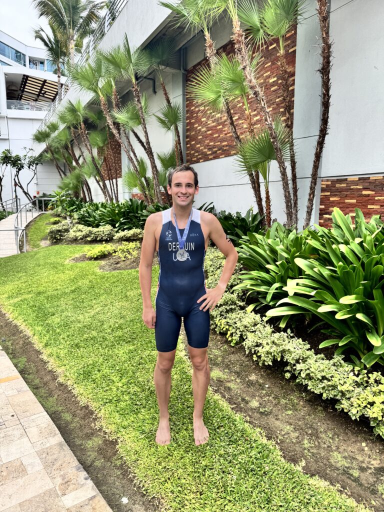
Just getting started! More to come!
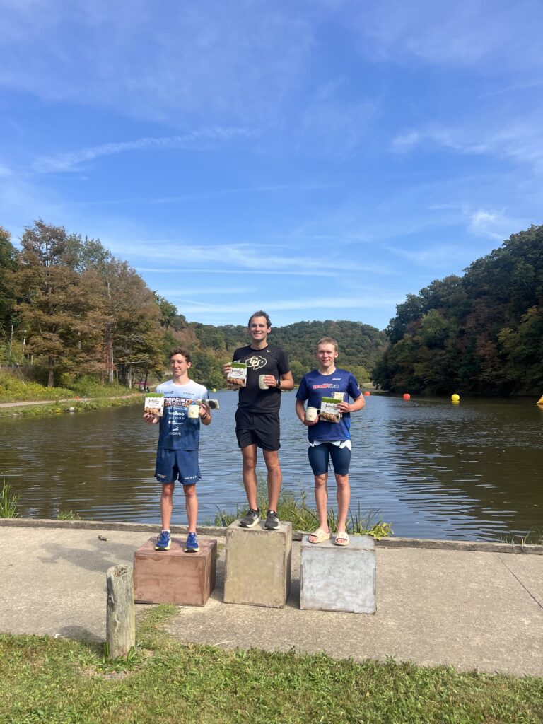
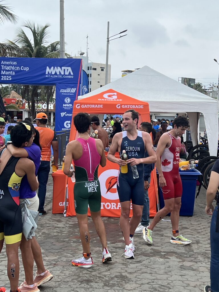
Highlights
-USA Triathlon CRP Recruit (since 2021)
-Placed 23rd in the 2025 World Triathlon Continental Cup in Manta, Ecuador.
-Won the 2025 Beaver County Tri Cup in Beaver County, PA
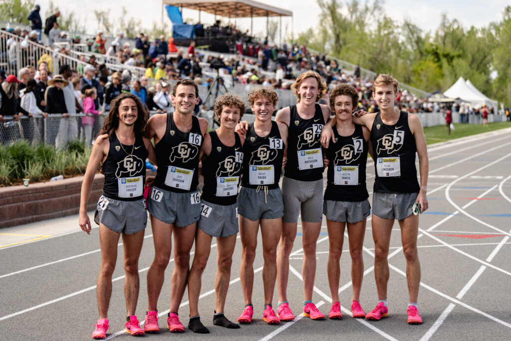
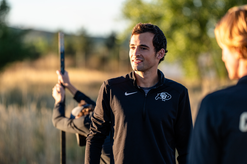
CU Boulder Track and Cross Country 2020-2024
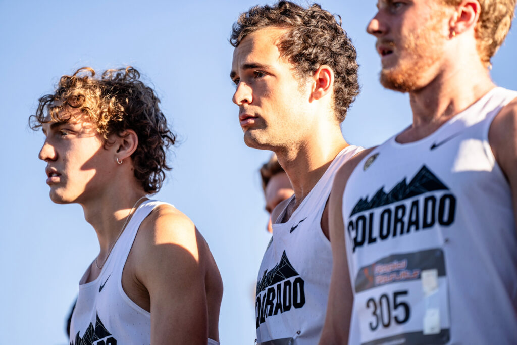
Track Highlights
-Ran Pac-12 Outdoor Championships 2022, 2023, 2024
-Placed in the top 8 in the 10K and 5K at the Pac-12 Outdoor Championships in 2023 and 2024:
2023: 10,000m 5th
2024: 10,000m 7th
2024: 5,000m 8th
-Raced NCAA west regionals in the track 10,000m in 2024
Cross Country Highlights
-Raced Pac-12’s Cross Country Championships in 2023. Placed 5th for CU scoring points!
-Raced in the 2023 NCAA Cross Country Championships
High School Swimming
Eden Prairie Minnesota 2016-2020
-Placed 6th at MN High School State Swim Meet in the 500 Freestyle with a time of 4:36.99.
-Made 3 state meet appearances.