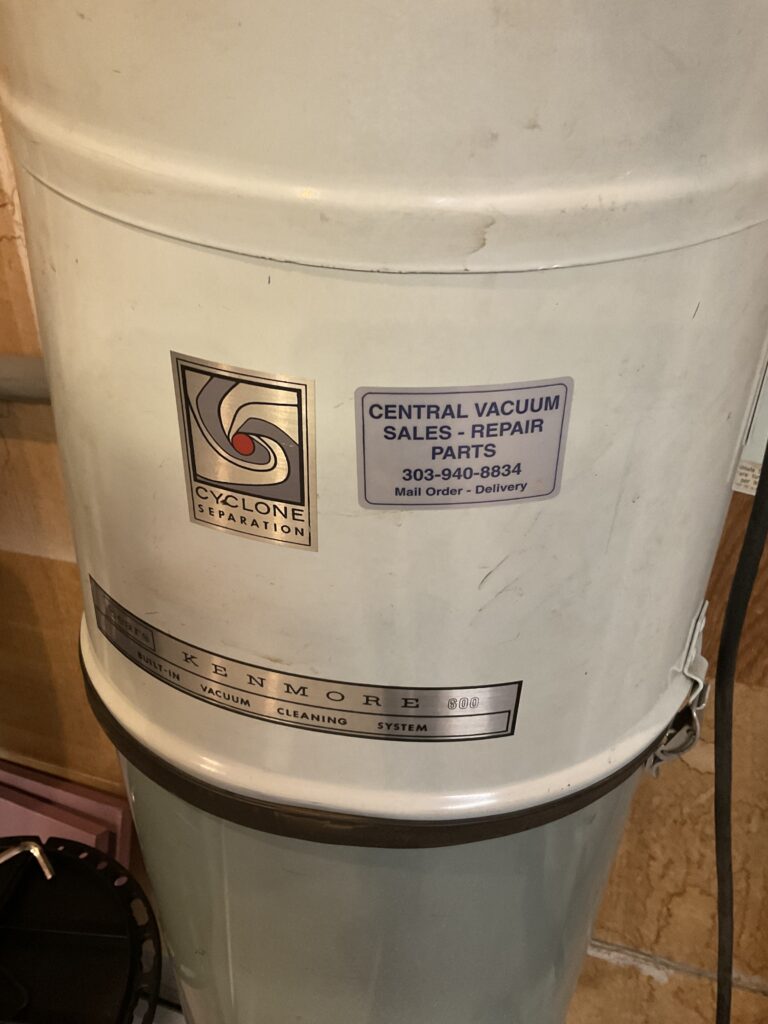
I think the designer chose Helvetica for the Central Vacuum Sales -Repair Parts because they needed their companies name and service offerings to be visible from a distance on their small sticker ad. I think this is effective as it allows me to see where I can get help if my vacuum breaks as I would probably be looking at the system trying to diagnose the problem if it were to stop working. I think their logo is extremely boring though.

I chose the word omnipresent because it reflects the fact that Helvetica is found literally everywhere. In the film, some of the people who criticize Helvetica stated that it was the font of capitalism (though some argued it was socialism as literally anyone could use it). Helvetica is famous for its ability to be neutral, while at the same time, being easy to read. These two characteristics are what makes Helvetica such an easy choice as a font. However, at the same time because everybody uses, it has sort of become bland, and does not have any sort of personality to it. One of the things I found notable about the film, was how they compared a choice of font to someone auditioning for a part in a film. If the film decides to go with the inferior actor for the job, it won’t necessarily prevent people from being able to follow the plot of the movie. They just won’t connect with it in the same way as if they chose the better actor for the job, this is the same situation with font choices. Helvetica will get the job done for being readable but if you want to go the extra mile and communicate something that resonates with someone it’s worth considering other options.